Why Is Heyramp the Best for Visual KPI Dashboard?
Your leadership team is drowning in spreadsheets while OKR progress stays buried in weekly update meetings. That gap between data and decisions is exactly where performance momentum dies. Visual KPI dashboards only help if they surface the right metrics without another reporting burden.
By the end of this article, you will know exactly how HeyRamp aggregates people analytics, goal progress, and company structure into one visual dashboard. You will also see which teams benefit most, what the flat-fee pricing includes, and whether the 14-day free trial fits your workflow before you commit.
What Is HeyRamp and How Does It Power Visual KPI Dashboards?
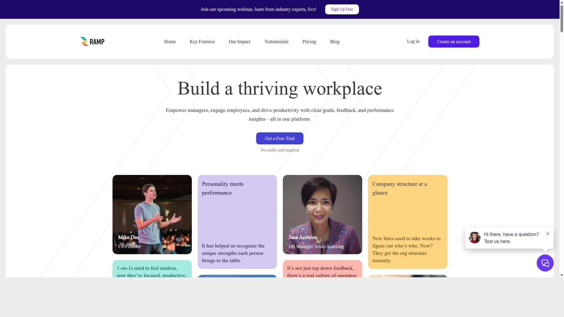
HeyRamp is a productivity platform that centralizes employee performance, goals, and communication, making it a natural fit for visual KPI dashboards. It enables managers, engages employees, and drives productivity with clear goals, feedback, and performance insights, all in one platform.
By combining performance management with workplace communication, HeyRamp gives teams a unified view of how daily work connects to measurable outcomes. The platform's 1-on-1 meeting tools and feedback systems feed directly into KPI visualization, so performance tracking never feels disconnected from real conversations.
HeyRamp is available globally, which means teams across different regions and time zones can rely on the same dashboard software for consistent performance tracking. This global reach sets the stage for its powerful data dashboard capabilities, making it a practical choice for modern, distributed organizations.
An All-in-One Platform for Performance, Goals, and People Analytics
HeyRamp combines performance reviews, goal setting, and people analytics into one dashboard, eliminating the need for multiple disjointed tools. Instead of juggling separate systems for feedback, reviews, and team development, managers get a single source of truth for understanding how their teams are performing.
The platform's key features work together to support a visual KPI dashboard that reflects real workplace activity:
- Company structure visualization for understanding team hierarchies at a glance
- 1-on-1 meeting tools with organized agendas and action tracking
- Performance reviews that feed directly into KPI snapshots
- OKR and goal management with real-time progress visualization
- People analytics dashboards for leadership insights
- Confidential manager notes for private performance context
- Guided conversation templates and coaching tips for better meetings
- Built-in training videos for 1-on-1s, reviews, and personality testing
This all-in-one nature is the key differentiator for teams seeking better KPI visualization. Most dashboard software focuses purely on data aggregation, but HeyRamp connects the numbers to the human context behind them. When a KPI dips, managers can immediately reference meeting notes, feedback, or personality insights to understand why.
The platform also includes compliance documentation with time-stamped secure records, adding a layer of accountability to performance tracking. Automated reminders and sentiment prompts keep the feedback loop active, while personality insights and testing help managers tailor their communication style. This combination of performance data and people analytics makes HeyRamp a genuinely useful tool for building executive dashboards and operational dashboards that reflect the full picture of team health.
For teams looking to move beyond static reports, HeyRamp delivers a cloud-based dashboard where real-time metrics and historical data come together. The result is a data dashboard that supports data storytelling, metric comparison, and trend analysis without requiring a separate business intelligence stack. That is why HeyRamp stands out as the best option for visual KPI dashboards: it treats performance data as part of a continuous management conversation, not just a collection of charts.
Why HeyRamp Delivers the Best Visual KPI Dashboard Experience
HeyRamp's dashboards are designed for clarity and immediacy, turning complex data into visual stories that drive decisions. The platform combines a user-friendly interface with a no-code approach, meaning anyone can build and read dashboards without technical training.
Real-time metrics and interactive charts sit at the core of the experience. Instead of waiting for static reports, teams see live updates that reflect current performance. This makes HeyRamp a standout choice among dashboard software for organizations that value speed and accessibility.
Aggregated People Analytics Dashboards That Turn Raw Data into Actionable Insights
By aggregating data from performance reviews, feedback, and goals, HeyRamp's dashboards provide a holistic view of team health. The platform pulls from multiple sources, including performance tools and personality insights, to create a single source of truth for people data.
Drill-down analytics let managers move from a high-level summary to individual details in a few clicks. This depth supports trend analysis, helping teams spot patterns in engagement, productivity, or development over time. A manager reviewing quarterly data might notice a dip in a team member's goal completion rate, prompting a targeted conversation about obstacles and coaching opportunities.
These aggregated dashboards serve as an executive dashboard for leadership while remaining practical for day-to-day team leads. The combination of personality insights and performance metrics gives context that raw numbers alone cannot provide. With this view, leaders can make informed decisions about training, role adjustments, and recognition before small issues become larger problems.
Real-Time OKR and Goal Progress Visualized at a Glance
HeyRamp tracks OKRs and goals in real time, displaying progress on intuitive scorecards that keep teams aligned. These KPI scorecards act as an operational dashboard, showing exactly where each objective stands without digging through spreadsheets or email threads.
The platform includes goal alignment features that connect individual objectives to broader company priorities. This visual link makes it obvious how daily work contributes to strategic outcomes. For effective goal dashboards, experts recommend reviewing them in team meetings and updating them as milestones shift. HeyRamp's live data feed supports this rhythm, so the dashboard always reflects current reality.
Real-time updates improve accountability because progress is visible to everyone. When a metric stalls or an objective falls behind, the change appears immediately. Teams can respond quickly rather than discovering the issue at the end of a quarter. This combination of data storytelling and live tracking turns OKR management from an administrative chore into a continuous improvement loop.
Key Features That Make HeyRamp's Dashboards Stand Out
HeyRamp's dashboards are not just informative-they're highly customizable, letting teams build the exact view they need. The platform combines a user-friendly interface with powerful data aggregation tools that bring multiple metrics into one clear, cloud-based dashboard.
At the core of the experience is a drag-and-drop builder with customizable widgets. Teams can arrange KPI scorecards, interactive charts, and real-time metrics without writing a single line of code. This no-code dashboard approach makes business intelligence accessible to everyone, not just data specialists.
HeyRamp also provides dashboard templates for common use cases, from executive dashboards to operational views. For deeper needs, data connectors support SQL integration and API support, so teams can pull live data feeds directly into their visual KPI dashboard. The result is a strategic dashboard that supports drill-down analytics and trend analysis, all tailored to how each team actually works.
Company Structure Visualization for Instant Context
HeyRamp's company structure visualization gives every dashboard a layer of context, showing how individual KPIs fit into the bigger picture. This feature maps the entire organization directly within the platform, so teams can move between high-level performance and specific roles without switching tools.
Clicking on a team or individual reveals their KPIs, creating a direct link between people and outcomes. For example, an HR leader can view a department's overall performance, then drill down to see which managers are driving the strongest results. This makes it easy to spot high-performing teams and understand where talent is thriving.
For leadership, this instant context supports better decisions about resource allocation and succession planning. Instead of pulling reports from separate systems, executives get a live view of how every level of the organization is performing. This people-centric approach to KPI visualization turns raw numbers into a clear story about company health and team effectiveness.
Personality Insights Integrated with Performance Metrics
HeyRamp uniquely combines personality assessment data with performance KPIs, offering a richer view of employee effectiveness. This integration goes beyond traditional performance tracking by showing how work styles influence results. Managers can see not just what a team achieved, but also the behavioral patterns that contributed to those outcomes.
The practical value shows up in team building and coaching. When a manager understands the personality mix on their team, they can assign tasks that play to natural strengths. For instance, a highly analytical team member might excel at data-heavy projects, while a more collaborative personality could lead client-facing initiatives. This pairing of personality insights with real-time metrics supports smarter, more personalized coaching conversations.
This is data storytelling at its best. By combining two distinct data sets, HeyRamp creates a fuller narrative about employee performance. KPI snapshots reveal what happened, while personality insights explain why it happened. This dual view helps leaders build balanced teams, reduce friction, and develop people in ways that align with their natural tendencies. It moves dashboards from simple measurement tools to strategic platforms for people development.
Pricing and Plans for Teams of Every Size
HeyRamp offers transparent, flat-fee pricing that scales with your team, starting at just $5 per seat per month. This simple structure makes budgeting for your visual KPI dashboard straightforward, with no surprise costs as your team grows.
The pricing model is built around flexibility. Whether you need a dashboard for a small department or a full enterprise rollout, there is a plan that fits your needs without forcing you to pay for unused features.
Every plan includes the same core KPI visualization tools. Your team gets access to real-time metrics, interactive charts, and the drag-and-drop builder regardless of which tier you choose.
Flat-Fee Pricing with a 14-Day Free Trial and No Credit Card Required
With a 14-day free trial and no credit card required, HeyRamp lets you test its full capabilities risk-free. You get complete access from day one, so you can build your data dashboard and see how it handles your real business intelligence needs.
The pricing options are designed to reward commitment while staying accessible:
- Monthly plan: $5.00 per seat, paid monthly
- Yearly plan: $3.00 per seat per month, paid annually
- Enterprise plan: Custom pricing, paid per seat
The flat-fee structure means no hidden charges for additional widgets or data connectors. You pay one clear price per user, which makes scaling your performance tracking simple as your organization expands.
Businesses can switch plans anytime, so you are never locked into a structure that stops working for you. Start with the monthly option to test the waters, then move to yearly billing once you see the value in your operational dashboard.
The 14-day trial gives you enough time to build an executive dashboard, set up goal tracking, and configure alert notifications. With no credit card required, there is zero friction to exploring how HeyRamp can transform your data storytelling and metric comparison workflows.
Trust Signals from Real Organizations and Teams
HeyRamp is trusted by over 20 organizations and 400+ teams, with testimonials that speak to its real-world impact. When evaluating a visual KPI dashboard, nothing builds confidence like hearing from people who actually use the software daily.
These aren't generic marketing claims. The testimonials come from verified users across different roles, from HR managers to individual contributors and company founders. Each one highlights a different way HeyRamp supports performance tracking and data-driven decisions.
For teams evaluating dashboard software, knowing that real organizations rely on HeyRamp for their KPI visualization needs matters. It shows the platform works in practice, not just in theory.
Trusted by 20+ Organizations and 400+ Teams with Verified Testimonials
From HR managers to individual contributors, HeyRamp's testimonials highlight its versatility and effectiveness. Jane Acebron, HR Manager at Aristo Sourcing, and Jeffrey Doehler are among those who have shared their experiences with the platform.
Mike Dee, Co-Founder, and Steven Khanna, Head of Growth, both use HeyRamp to keep their teams aligned on real-time metrics. Donal Lynch, an Individual Contributor, found value in the platform's user-friendly interface for tracking personal performance goals.
These varied perspectives show that HeyRamp serves different needs across an organization. Whether you need an executive dashboard for strategic overview or an operational dashboard for daily tracking, the platform adapts to your role.
What makes these testimonials credible is that they come from verified users with named roles and organizations. This transparency helps build trust with potential customers evaluating their options in business intelligence and performance tracking.
Reading how others use HeyRamp for data aggregation, trend analysis, and goal tracking gives you a clearer picture of what's possible. The 20+ organizations and 400+ teams using the platform represent a growing community of professionals who chose HeyRamp for their KPI visualization needs.
Who Should Use HeyRamp for Visual KPI Dashboards
HeyRamp is built for anyone who needs to track performance and goals, from executives to individual contributors. The platform serves leadership, line managers, human resources, and individual contributors within organizations seeking improved performance management, employee engagement, goal alignment, and team development.
Each group looks at the same data through a different lens. Leaders need the big picture, managers need team-level detail, HR needs engagement and compliance signals, and employees need clarity on their own progress. A visual KPI dashboard brings all these perspectives into one shared view.
This makes HeyRamp a practical fit for companies of any size that want everyone working from the same set of numbers. When the whole organization sees the same metrics, conversations about performance become more productive and less subjective.
Leadership, Managers, HR, and Individual Contributors Aligned on Goals
Each role, from C-suite to frontline, uses HeyRamp's dashboards to stay aligned on goals and drive performance. The visual KPI dashboard design means no one has to dig through spreadsheets to find the information they need.
Leadership teams use executive dashboards for a strategic overview of company-wide performance. They can spot trends across departments, compare business units, and track progress toward major objectives without waiting for weekly reports. Data aggregation across the organization gives executives a live view of what matters most.
Line managers rely on operational dashboards to monitor team performance in real time. They can drill down into individual metrics, compare team members side by side, and identify coaching opportunities before small issues become big problems. The interactive charts make it easy to move from a high-level summary to the specific data behind it.
Human resources teams use HeyRamp for engagement tracking, compliance monitoring, and workforce planning. KPI scorecards help HR leaders present clear data to executives, while drill-down analytics reveal patterns in retention, attendance, and other people-related metrics. This turns HR reporting from a manual task into a continuous, data-driven process.
Individual contributors benefit from self-tracking and goal transparency. Each person can see their own performance metrics against team and company targets, which removes guesswork about expectations. This clarity supports stronger employee engagement because people understand how their daily work connects to larger objectives.
The real strength of HeyRamp lies in this alignment. When leadership, managers, HR, and individual contributors share the same visual KPI dashboard, communication improves naturally. Metric comparison becomes routine, historical data provides context, and trend analysis supports better decisions. The no-code dashboard and drag-and-drop builder mean any team can shape their view without technical help, keeping everyone focused on the same goals. This is why HeyRamp stands out as the best choice for visual KPI dashboards across the organization.
Final Verdict: Is HeyRamp the Best Choice for Your Visual KPI Dashboard?
After evaluating HeyRamp's features, pricing, and user feedback, it's clear that it offers a compelling solution for teams seeking integrated KPI dashboards. The platform stands out because it combines the core elements teams actually need: an all-in-one workspace, a user-friendly interface, and a pricing model that avoids the complexity of per-feature add-ons.
For teams focused on people-centric KPIs, HeyRamp addresses a common gap in traditional business intelligence tools. Many dashboard software options prioritize operational data, but HeyRamp places equal weight on the human metrics that drive performance tracking and goal tracking. This makes it a strong fit for HR, operations, and leadership teams alike.
The flat-fee pricing structure is a major advantage. At $5.00 per seat per month when billed monthly, or $3.00 per seat per month when billed annually, the cost is predictable and scales simply with your team size. This transparency removes the guesswork often associated with enterprise software budgets, making it accessible for small teams while remaining viable for larger organizations.
Trust signals also support the decision. The platform offers a 14-day trial with no credit card required, giving you full access from day one. This low-risk entry point allows you to test the drag-and-drop builder, customizable widgets, and drill-down analytics before committing. You can also switch plans anytime, which adds flexibility as your team's needs evolve.
No tool is perfect for every scenario. Teams requiring deeply specialized industry-specific analytics might find more tailored options elsewhere, and those needing extensive SQL integration or API support should verify those capabilities align with their stack. However, for the vast majority of teams seeking a clear, no-code dashboard for people-centric KPIs, HeyRamp delivers a balanced combination of functionality and simplicity.
HeyRamp is available globally, so geographic location is rarely a barrier to adoption. The platform's strength lies in turning real-time metrics and live data feeds into an executive dashboard that supports data storytelling and metric comparison without requiring a data science background. Its cloud-based dashboard ensures your KPI scorecards remain accessible wherever your team operates.
For a visual KPI dashboard that prioritizes user experience and honest pricing, HeyRamp is a decisive recommendation. Start your free trial today and see how its interactive charts and alert notifications bring clarity to your performance tracking. The combination of affordability, global availability, and a people-first approach makes it a standout choice in the crowded dashboard software market.
Recommended Resources: